fbpx
10 Examples of Successful Progressive Web Apps

PWAs let you deliver an app-like experience without the hassle of using an app store. Our 10 successful Progressive web app examples and clear how-to instructions will see you making your own PWA in no time!

What are PWAs and why is everyone talking about them?

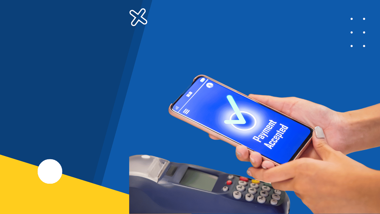
Progressive Web Apps are web apps that give users an app-like experience, without having to go through the app store or download anything! PWAs have all the great features of mobile apps like speed and offline usage, but they are just webpages.

PWAs have exploded in popularity as we move towards a 5G, always-connected world. PWAs can now work offline, integrate with native device functions and even send notifications!  

The best progressive web apps have some or all of the following features:

[eckosc_column_container count=”six” align=”center”]

[eckosc_column_item]

App Like

app like

They feel and operate like an app

[/eckosc_column_item]

[eckosc_column_item]

Progressive

Progressive

They work on any browser

[/eckosc_column_item]

[eckosc_column_item]

Responsive

responsive

They work on any device

[/eckosc_column_item]

[eckosc_column_item]

Independent

independent

They have some offline functions

[/eckosc_column_item]

[eckosc_column_item]

Up-to-date

upto date pwa

They use a service worker update process

[/eckosc_column_item]

[eckosc_column_item]

Installable

installable pwa

They can be saved to any home screen, without the need for an app store.

[/eckosc_column_item]
[/eckosc_column_container]

App-like: They feel and operate like an app.
Progressive: They work on any browser.
Responsive: They work on any device.
Independent: They have some offline functions.
Up-to-date: They use a service worker update process.
Installable: They can be saved to any home screen, without the need for an app store.

How are PWAs different from Mobile Apps?

The main difference between PWAs and Mobile Apps is that apps must be downloaded from an app store whereas PWAs are just web pages that can be deployed to the mobile web. PWAs deliver an app-like experience, except users don’t need to download them. In the past, most developers deployed their apps as both a PWA and a native app for Android and iOS. These days, many companies are using a PWA in place of a mobile app.

Interesting PWA stats

The gap between PWAs and native apps is shrinking by the day. Here are some fascinating statistics that show how PWAs are transforming how companies deliver apps to their customers.

Treebo’s PWA helped them 4x their conversion rates year-on-year compared with their mobile app. They saw a 3x increase in conversion rates for repeat users, too! This shows how reliable, fast and engaging PWAs are, compared with standard mobile apps.

pwa-stats--treebo

Uber’s PWA was only 50k gzipped, meaning it took less than 3 seconds to load over 2G networks.
This is a great example of how PWA’s speed can help companies attract users with slow mobile data packages.

pwa-stats--Uber

Pinterest actually rebuilt their entire mobile site and relaunched it as a PWA. Visitors started spending 40 percent longer on the site, and core engagements shot up by 60 percent. Pinterest’s experience shows how PWAs give customers the content they want, without slowing them down.

pwa-stats--Pinterest

Why do you need a PWA?

A better question is, why wouldn’t you need a PWA? The gap between PWAs and native apps has closed over the past two years and many companies are now using PWAs instead of native apps.

Why?
The reasons are simple:

  • Speed: PWAs are fast and they respond quickly.
  • Reliability: PWAs load almost instantly.
  • Engaging: PWAs are great at engaging customers and users.

So, if you want to give your customers a faster, simpler and more intuitive experience, PWAs are the way to go!

10 Successful Progressive Web App Examples

If you’re looking for inspiration, we’ve got your back! Here are ten successful progressive web app examples to inspire you and really get your creative juices flowing.

#1 Forbes

Background of App

Prior to launching their all-new PWA mobile web experience March 7, 2017, Forbes already had a great mobile app. 

The Problem

Forbes was an established news site, but it had a problem: it was struggling to respond to the way that its readers were consuming content and it needed a way of addressing the rapid changes in the marketplace.

How switching to a PWA helped solve their problems

Forbes’ PWA helped them offer a better, faster and more engaging experience for its readers. The mobile pages loaded within eight-tenths of a second and its readers saved between 2 and 10 seconds on every page view.

Impact of PWA

Forbes’ redesigned website gave it better performance than any other news media site and helped it become a product-driven company. Forbes’ PWA is one of the best examples of a progressive web app. It loads in 2.5 seconds, which is 4 seconds faster than Forbes’ old mobile app. Among casual readers, engagement has tripled and impressions per visit are up 10 percent.

#2 Twitter Lite

Background of App

Twitter spent months developing its PWA and had previously used a Windows native app and Twitter lite app for Andoird, both of which featured ‘data-saver’ modes. They decided to build a PWA based on the same web interface that they were using to power the Windows 10 app.

The Problem

Twitter’s problem was that many of their users had underpowered devices or suffered from poor or expensive bandwidths. Pages took too long to load, even when using the data-saver mode. Twitter knew that there must be a better solution.

How switching to a PWA solved their problems

Twitter’s PWA replaced its native Windows app and gave much faster loading speeds. It really helped users who had slow connection speeds.

Impact of PWA

Following the launch of its PWA, Twitter saw that the number of page views per session shot up 65 percent, and users sent 75 percent more tweets. Twitter also saw a 20 percent decrease in bounce rate. Twitter Lite’s page load times is sub-three seconds, even on slower networks.


#3 Pinterest

Background of App

Pinterest’s interest in PWAs began when they shifted their focus to international growth. While their mobile app has served them well in the U.S. market, they realized that international users didn’t have the same speeds and hardware. This led them to the mobile web.

The Problem

Pinterest’s problem was that their old web experience converted less than one percent of visitors into either logins (existing users) sign-ups (new users) or native app installs. This poor conversion rate led Pinterest to start developing a PWA.pinterest-pwa

How switching to a PWA solved their problems

Compared with the old native apps, the new PWA was tiny, with a 150KB home feed load. By way of comparison, the Android app was 9.6MB and the iOS app was 56MB.

The smaller Progressive Web Application was much more accessible for Pinterest’s international visitors.

Impact of PWA

Compared with Pinterest’s old mobile web, their Progressive Web App saw ad clickthroughs increase by over 50 percent and core engagement shot up by 60 percent.

#4 Starbucks

Background of App

Starbucks released its mobile ordering app in 2015 but it wasn’t very well suited to emerging markets such as rural communities where internet connections are slower and less reliable.

The Problem

Starbucks wanted to add ordering functionality to their main website but realized that many of their customers didn’t have very good internet connections. People wanted to be able to browse the Starbucks menu and add items to their carts even when they weren’t online. Starbucks knew that developing a PWA was the was forward.

starbucks-pwa
How switching to a PWA solved their problems

Starbucks created a PWA for their ordering system so that both established (urban) and emerging (rural) markets were catered to. Their PWA also let them service people whose access to internet connection came and went throughout the day, for example, people who had Wi-Fi at home and at work but didn’t use mobile data when they were out and about.

Impact of PWA

Starbucks PWA looks and feels like a native app but is tiny, fast and highly responsive. Because it’s available offline, it has helped Starbucks attract customers who lack reliable internet or who lose access throughout their day.

#5 The Washington Post

Background of App

In 2016, The Washington Post already offered their readers a great mobile experience but they knew that they needed to up their game. Over 55 percent of their traffic was coming from mobile devices and these readers weren’t enjoying a great experience. Page load times were low and bounce rates were high.  

The Problem

The Post’s main challenge was how to accommodate readers who had slower, older devices, or poor, unreliable internet connections. They wanted to find a better solution that would help readers access their site anywhere across the mobile web.

the-washington-post-pwa
How switching to a PWA solved their problems

The Post joined the Accelerated Mobile Pages Project and began reworking their main site as a PWA. When they released their new platform in 2016, readers were amazed that they could load pages almost instantly, no matter where they were or what type of internet connection they had.

Impact of PWA

The Post’s new average page load time is 400 milliseconds, almost 90 percent faster than their old mobile website. The Post saw the number of returning users increase by over 60 percent, showing that PWAs are fantastic for attracting and retaining new customers.


#6 U.S. Auto Parts

Background of App

Before launching its PWA last year, U.S. Auto Parts was already established as one of the largest online providers of auto parts and accessories and had a great mobile website for carparts.com.

The Problem

U.S. Auto Parts realized that their site wasn’t very accessible for do-it-yourself customers who sometimes had intermitted or slow internet connections. Their challenge was to offer their customers a faster and more convenient app-like experience on the mobile web.us-autoparts-pwa

How switching to a PWA solved their problems

The PWA made it easier for their customers to navigate through their huge inventory in less time. It resulted in faster load times and simpler, cleaner checkout experiences.

Impact of PWA

The PWA helped remove points of friction for customers and reduced bounce rates by 20 percent. Customers were better able to find the products they needed in the least possible amount of time.

#7 Trivago Hotel Booking

Background of App

Prior to the release of their PWA, Trivago already offered a free Android and iOS app that let users choose the best hotel according to their budget and preferences.

The Problem

Trivago realized that users in emerging areas and overseas markets found their mobile apps slow to load and clunky to navigate. They were losing potential customers due to a high bounce rate and knew they needed to do something about it.trivago-pwa

How switching to a PWA solved their problems

Trivago’s PWA revolutionized their users’ experiences by offering an offline mode, faster speeds and push notifications that didn’t slow down the booking experience.

Impact of PWA

The new PWA helped increase the click-through rate by over 30 percent and drastically improved user engagement with Trivagos’ site. It was extremely effective in attracting customers for emerging (rural or overseas) markets who used older devices over slower internet connections.

#8 Tinder

Background of App

Tinder already had a great mobile app, but they wanted to push forward with the latest market trends after realizing that their mobile experience lagged far behind what their competitors were offering.

The Problem

Tinder didn’t face a specific problem but saw that the click-through rate on their old mobile app wasn’t as high as it could have been. They challenged themselves to build a Tinder PWA in order to offer their customers the ultimate in speed and convenience. tinder-pwa

How switching to a PWA solved their problems

Tinder’s PWA was tiny compared with the native Tinder apps that it replaced. Clever use of service workers and JavaScript performance optimization let them offer their customers a smoother, faster and most responsive experience.

Impact of PWA

Tinder PWA is one of the best progressive web apps on the market. It has helped reduce bounce rates by 15 percent and increase click-through rates by 30 percent, compared with the old native mobile apps.

#9 OLX

Background of App

As India’s top online classified app providers, Olx enjoyed a dominant position as the go-to marketplace for both buyers and sellers in a range of countries including Brazil, India, and the Philippines, among others.

The Problem

The analysis showed that bounce rates on the OLX website were high as mobile users were using older handsets over poor or patchy internet connections. OLX knew that they could reduce bounce rates by increasing clickthrough rates, and the challenge was set.olx-pwa

How switching to a PWA solved their problems

OLX’s PWA was faster, smaller and more convenient than its older website, helping mobile users stay on the page longer and engage more with the content.  

Impact of PWA

OLX’s PWA helped boost re-engagement by 250 percent, compared with its older native apps and website.

Clickthrough rates have increased by almost 150 percent while bounce rates have been slashed by 80 percent.

#10 9Gag

Background of App

Hong Kong-based social media platform 9Gag enjoyed a worldwide user base from the UK, France, Germany, the U.S., and Brazil. It let its users upload images, video clips, and memes via its native mobile apps for Android and iOS.

The Problem

9Gag realized that its app was taxing for many of its user’s mobile devices, so it challenged itself to create a sleeker, smoother alternative that would help drive engagement. 9gag-pwa

How switching to a PWA solved their problems

9Gag started developing a PWA to take advantage of the rich offline features and fast page loading speeds that it offered. This reduced the bounce rate and increased user engagement.

Impact of PWA

9Gag’s PWA encouraged its users to stay on the page for 25 percent longer, compared with the older mobile website.


How to build your own PWA

To build your own PWA, it’s important to understand that you don’t need to use every feature of a PWA! The keyword is ‘progressive’: you simply need to improve your app in ways that make it better for the end users.

The simplest way to make a simple ‘Hello World’ PWA is to head to GitHub and clone this app, then deploy it with Firebase.

If you have a basic knowledge of HTML, CSS, JavaScript and Chrome DevTools then you can head here and follow Pete LePage’s instructions for creating a PWA via the ‘app shell’ method.  

To follow this method you’ll need

The process is as follows:

Step 1: Download source code and unpack the zipped filed.

Step 2: Install Web Server for Chrome and click on the app shortcut.

Step 3: Choose the downloaded file and serve your work

By stopping and restarting the server, you’ll be able to see your new PWA in your browser! You can then add functionality and UI features, according to your needs.

If you’re not a coder, we can do it for you too! Drop us an email at hello@devathon.com or visit our website for Progressive web app Development

Author

PWAs vs Native Apps – Which is Better in 2021? Low code vs. No code: Which is better for web and mobile app development? MEAN stack vs. MERN stack for Full stack Javascript development
View Comments
  • Hi,
    I have seen your post and I must say you have a great writing skill. This post gave me all the details about the progressive web app, Thanks for posting such a great article.

  • Have been surfing online more than 2 hours for the best article on PWA,
    yet I never found any interesting article like yours. Keep it up!

DevathonHave an app idea?

Talk to our app development experts today.