How To Succeed In Mobile App Wireframe design?
In the world of overrated terms “web development”, a mobile app wireframe design is one of the most underrated terms. The design of wireframes is considered when people look for the bigger picture.
While designing the UI-UX, people forget the simple norm of general to specific shifting. As the complexity increases and so does the approach become more difficult, this is where the designing of the wireframes comes in handy.
Before diving into the “How to”, let’s first see why we need them in the first place.
What are mobile app wireframes?
Wireframes are the skeletal layouts of an application or a website that is being designed. The specificity comes into play, the elements and the features have to be placed at specific locations. Take a building, in the process of making it, first the foundation is laid and then pieces are fitted together from the skeleton structure on a piece of paper, wireframes do the same for the website or application structure such as a smart home application.
The designing of wireframes is commonly known as wireframing. For the construction of a building, the framework or the skeletal structure is important while designing a web application or mobile application, wireframing is important to make it user-friendly. This entirely and solely works to make the journey smooth and the destination easy to reach.
As for the building, the layers of cementing and painting are done later to increase the visual appeal, the visual contents and appealing stuff are added after wireframing. The simpler it sounds after the definition, the more complex it gets when it is being done.
It is a very goal-oriented procedure, one has to keep in mind is the goal of the product or the destination of the service. The main focus should be on UX. The arrangement of the elements and their interaction with each other and with the user is the utmost important task in mobile app wireframing.
What not to do while designing the mobile app wireframe?
- Do not even think of skipping the process.
- Do not beautify (visually appealing designs added first) and then get into the wireframing business).
- Do not do it just for the sake of doing it.
One has to keep in mind that skipping this entirely can lead to the failure of the entire process of web and mobile app development at the end.
Again taking the example of the construction of a building, the foundation must be laid first based on the skeletal framework that has been prepared, then only you can jump to beautify your building, as a designer one has to understand and follow the steps where designing the mobile app wireframe comes first and then the visually appealing content is added next not the other way round.
For the most part, people do not understand the importance and come up with some trashy design of wireframes and the main foundation becomes faulty, hence the entire designing at later stages becomes faulty. If one wants to skip the reworking part, mobile app wireframing must never be ignored.
What to do while designing the mobile app wireframe?
- Keep it monochrome and simple;
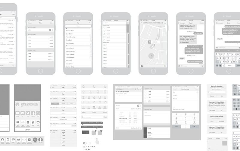
Less the color is used, more attention will be given to the framework. The color increases the distraction. The main goal is to locate specific elements at specific places and show their interactions, and the use of minimal color does the work more accurately.
- The use of a single design should be promoted to decrease the distraction;
Similar elements should have the same design to avoid distraction. If the similar ones look different, then others might perceive it as different and it might lead to confusion at later stages.
- Use the basic designs while designing;
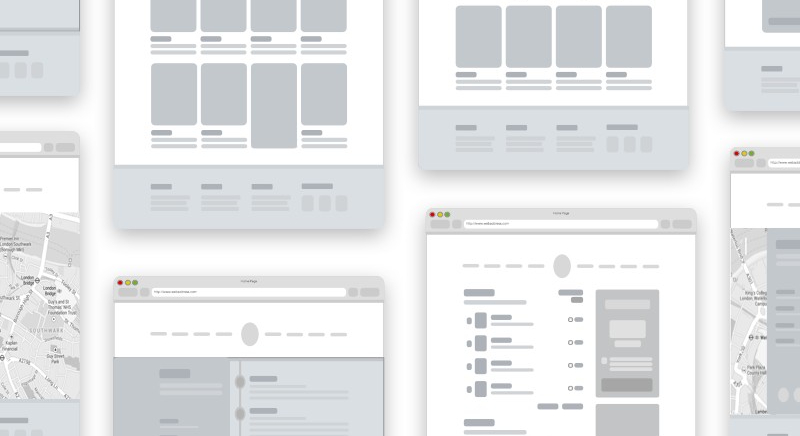
This too can cause unnecessary distraction. The basic design makes it easier to focus on the bigger picture. Using some artistic design might take much time than it is required to.
- Do use the real content instead of dummy texts;
The dummy texts can make the work more tiresome as it might make the context confusing. The real content will make it easier for even the designer to understand what will go where and how the interaction has to happen exactly. This will certainly add more value to the design of the app wireframe.
- Add details in a step by step manner avoiding excess details at the same time;
Intricate details can be skipped when one is working on low-fidelity wireframes. High-fidelity ones too need detailed elements at specific places and thus detailing it at every possible site isn’t required.
- Get to interactive prototypes if required;
This is generally not required for the low-fidelity ones. But for the complicated ones, the interactive prototypes come as a savior because some of the interfaces are quite difficult to explain and comments don’t help much at that time.
- Add comments wherever it is required to reduce the labor work of explaining;
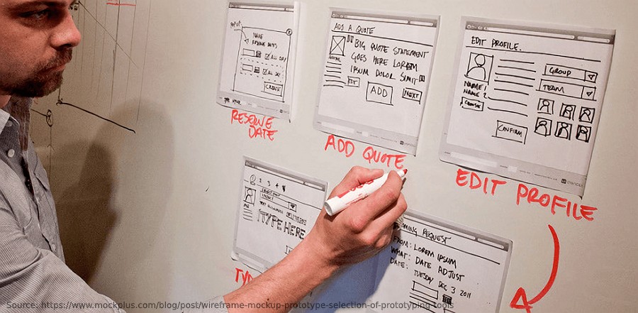 This practice reduces the explaining labor one has to do and makes it easier for others to read and understand.
What are the tools used in designing a mobile or web app wireframe?
There are two ways in which tools are generally customized which are simple and collaborative.
– Simple ones are for beginners and can be used for the designing of static wireframes.
– For the advanced works and complicated interactions to show, collaborative ones are used. These types of tools allow teamwork and are efficient.
There are so many tools available for designing the wireframe like Cacoo, Sketch, Figma, Adobe XD, Invision Studio, Omnigraffle, Framer X, Axure, Principle, Balsamiq, Moqups, Adobe Illustrator, Adobe Photoshop, etc.
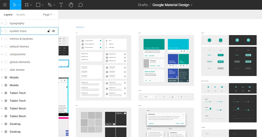 Some of them even have a free option, importing can be done and frameworks can be created from scratch too which makes them more accessible.
What to ponder on?
Here are some of the important aspects related to mobile app wireframing which need to be kept in mind to understand the concepts of this topic:
Firstly, you can break up wireframes with the help of user flow and tabs in the application you are using. This can help you organize your elements properly.
Secondly, consider adding some gesture images as this will help you convey your intention of interacting with the app wireframe developers and the users.
Lastly, remember that your app will be used by users who can be from either of the two OS – iOS and Android. You must create separate and optimized versions for both systems at the same time.
Mobile app wireframing – The best practices
Mobile app wireframing is all about structuring and prototyping and certain practices can help you bring out the best results. The following practices can boost the designs and the efficiency of the final products.
Here are some of the Dos and Don’ts that should be kept in mind while dealing with mobile app wireframing:
The Dos
The research will never fail you
Be it a product development project or an ordinary small-scale project, the first thing to do is carry out research to bring out the relevant data. Understand the strengths, weaknesses, and target areas of the market and its users. It is important to understand the potential of the market you are dealing with and this will give you a clearer image of the app wireframes.
Proper navigation assistance
Developers often tend to put less focus on this step, but remember that this can be the game-changer. Users on the internet need reassurance when it comes to navigation. Our job is to reassure them that they have made a successful landing and reached their destination. The usage of contrasting colors and catchy visual aids can help you achieve that mark.
Categorizing and refining information
It is always advised that categorizing content based on certain parameters can prove to be effective in mobile app wireframing. This is because mixing the content haphazardly does no good and is considered to be a bad practice in the industry. Usage of card sorting for testing the categories on actual users can help you with the refining process of your mobile app wireframe.
Collaboration is the key
There is a magic that unfolds as we use mobile app wireframing tools. Did you know that wireframing tools facilitated team collaboration and the collection of user feedback? Well here is the catch. The wireframing tool allows working multiple tasks such as working on online wireframes, commenting on them and sharing them on devices and web browsers, all at the same time.
The Don’ts
Elevation of style over substance
Wireframing is more than just colors and visually striking images. Many developers commit this mistake by adding extra visual elements which might be unnecessary for the project. The best piece of advice, in this case, would be to leave the decoration process to the handlers of the final stages of UI wireframing. Wireframing depends on the functionalities and performance of the workflow.
Skimping the content
Always remember the fact that app wireframing is all about being quick and dirty. But that does not mean that you will be using duplicate content just to make up the entire project in a hurry. To avoid later reworks, make sure you put in original content and do not put in any irrelevant content. Remember that the real data will always drive the wireframing process.
Forgetting to test on real users
Do not forget to test your wireframe on real users! This is a big mistake the developers do and this is why it should be tested on actual users. The testing stage can bring out the loopholes of the project and the developers can know from the users which functionalities need to be fixed and updated.
Takeaway
Mobile app wireframe design is the most basic step not to be skipped, not to be taken for granted, and not to be ornamented much. Mobile wireframe design doesn’t get the much-needed attention that it requires. The time has come to realize its worth because accessing apps and the web using mobile phones has become a niche activity. Hence one has to ensure that the apps and websites being designed work on our mobile phones.
Are you looking to get your App built? Contact us at hello@devathon.com or visit our website Devathon to find out how we can breathe life into your vision with beautiful designs, quality development, and continuous testing.


